Tableau Coursework
During the second semester of 2021, I had the pleasure of learning how to use Tableau as part of my Data Science coursework. In this unit’s major assignment, I was required to produce a dashboard which would deliver information in a visually interesting way, aimed at Australian readers.
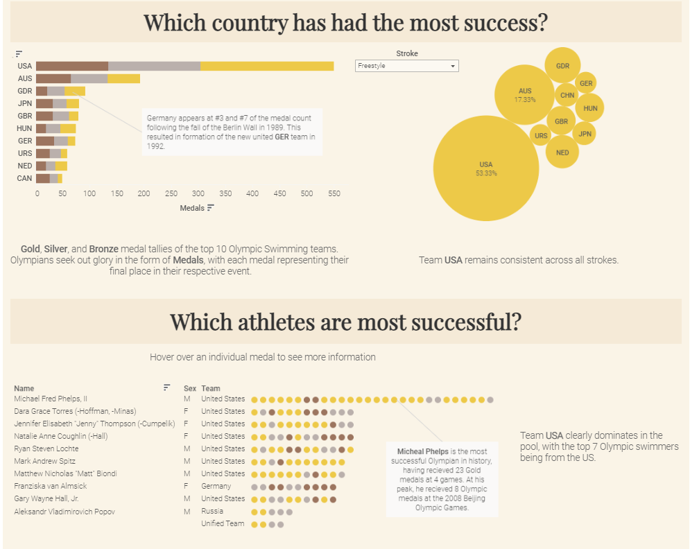
My topic of choice was the “History of Olympic Swimming”. Swimming is one of four sports present at every modern Olympic Games, meaning there is wealth of information available. However, the dataset used required some grouping and aggregation to avoid “double counting” of medals, due to the granularity of the data. These changes were implemented using the pandas package in Python. Within the visualization, there is a focus on changes in gender and nationalities, most successful nations and individual athletes, and how the average athlete has changed.
Below are some hightlights of the visualization:
Overall, I am quite proud of how it came together, and I can’t wait to use Tableau for my personal projects. In future, I will likely upgrade to a premium Tableau account, and implement data connectors to allow for flexible reporting.
Click here to explore my visualization.